- January 3, 2026
- Gordon Bond
They say never judge a book by its cover, but when was the last time you bought an ugly book? Humans are visual creatures and “image” matters more than we might want to admit. Sooner or later, most history groups realize the importance of “branding” to their missions. A professional image is a clue an organization is worth visiting, joining, or supporting. And, cultivating such an image often starts with a snazzy logo.
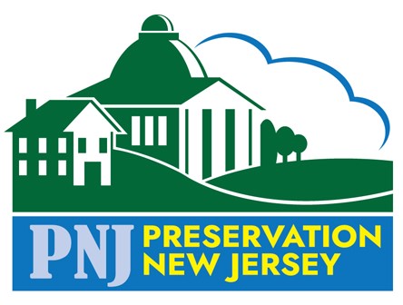
When I designed the new PNJ logo, the process began with a conversation with the board about preferences and expectations. I put together a couple concepts based on that conversation, trying different fonts and color schemes. While “preservation” encompasses a lot of things, PNJ’s work is primarily architectural spaces, so the final logo incorporates both “grand” structures and vernacular, as well as the open spaces of historic farms, parks, battlefields, etc. We went through a number of variations in colors, finding something that would work with branding and be distinct from other NJ history groups.
The process moved along thanks to PNJ having a general understanding of what they wanted. Not every client does, so in honor of the one year anniversary of PNJ unveiling its new logo, this article will share considerations your group should keep in mind if they would like to spruce-up their image!
As a professional freelance graphic designer, I am biased—but resist the instinct to rush to AI or someone’s cousin who works cheap. Ideally, the logo will become the public face of your organization for decades. Find someone who understands your mission—and your budget. Design can be subjective, so the more guidance up front, the quicker you home in on a logo that meets your expectations. This is especially helpful with a limited budget when being charged by the hour!
Things to consider at the start:
- Overall Feel – An organization dealing with a serious subject needs a serious logo; a lighter family-friendly theme may need something playful.
- Uses – How will the logo be used? Raster art is best for digital (website, social media, eblasts); vector where high resolution matters (print, embroidery) or for enlargements (banner, sign, billboard).
- Color Palate – Are there specific color schemes you prefer? A colonial history group might want earth tones; a military history group “army green”; an historic lighthouse blues and sandy browns. What are the colors of your museum or historic house?
- Typography – Clean sanserif fonts may be too modern for colonial history groups. Would a stencil font be appropriate for your military history group or cliché?
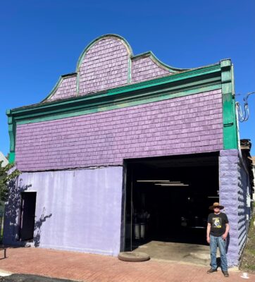
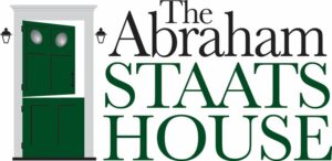
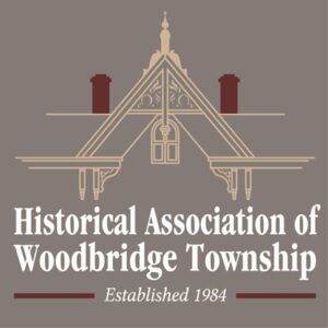
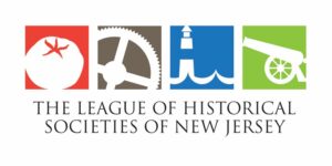
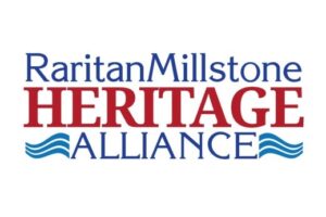
- Iconography – Can you be represented by an icon? If a group has a building, distinctive architectural elements might be used:
- Or perhaps icons that reflect a range of topics or even something abstract:
In addition to representing the organization, museum exhibits or events often benefit from a title logo that can be used in promotions and carried over into the exhibit panels.
Once a final design is approved, I supply it in a variety of industry-standard digital file formats that can be used for everything from business cards to billboards. And, hopefully, the result will proudly represent the organization for many years to come!